On this page
These sales one-pager examples show what each format prioritizes and which one fits your audience. So you need a one-pager — but what kind of one-pager, exactly? That question matters more than most people expect, because a one-pager is really just a single-page document that gives a high-level overview of one topic. You can use one for almost anything — summarizing an event, introducing a company, pitching to investors, or selling a product. The format is flexible. The trick is knowing which version fits the job in front of you.
(If you’re past the inspiration stage and ready to build, our step-by-step guide on how to create a sales one-pager has the full content checklist and design walkthrough. This page is the examples library; that one is the build manual.)
Here’s the thing to keep in mind: a one-pager only works when it’s tailored to its audience. That means deciding what to prioritize — design or content, story or specs — based on what the reader actually cares about.
Let’s take a quick example. In the business world, one-pagers tend to be heavy on text and light on graphics, because the people reading them are evaluating substance — can this solve my problem, and at what cost? In advertising, the opposite is true. There, a one-pager has to be eye-catching and visually striking, because grabbing attention is the goal. Same document type, completely different priorities.
This doesn’t mean there’s one “right” way to build a one-pager… it does mean you should understand the norms of your industry and your reader before you start. When you design and write around what your audience expects, you can be confident the finished piece will actually land.
Below, we’ll walk through the most common types of one-pagers used by sales and marketing teams — what each one is for, why the format works, and what to include — with real-world examples you can pull inspiration from.
Still managing sales assets the old way?
B2B one-pager
Think of a business-to-business (B2B) one-pager as a sales proposal boiled down to its essentials. The reader is rarely browsing for fun — they have a problem, and they’re scanning to see whether you can solve it.
That’s why this format lives or dies on its substance, not its styling. You can go light on the visuals here and pour your energy into one thing: naming the buyer’s pain point clearly and showing, in plain terms, how your solution addresses it.
A few things worth including:
- The specific problem you solve. Lead with the pain, not your feature list — readers recognize themselves in problems, not specs.
- Outcomes, not just capabilities. Frame benefits as results the business will see (faster onboarding, lower spend, fewer support tickets).
- A reason to believe. A customer name, a metric, or a short proof point does more work than another adjective.
A clean, focused B2B one-pager can genuinely move a deal forward — sometimes faster than a full proposal would.
B2B one-pager examples
A few B2B one-pagers to study (note that some of these are vendor-hosted PDFs that may have moved — see the linked source if it loads):
- AWS One-Pager Template — Data Warehouse
- AWS Enterprise Support One-Pager Template
- Azure 101 One-Pager
- Microsoft Practice One-Pager
- Oculus Business Data Sheet
Healthcare one-pager
Healthcare one-pagers carry a particular tension: the subject matter is often dense and detail-heavy, but the reader — a patient, a provider, a public-health official — needs to absorb it quickly and without confusion. So before anything else, pin down the single main theme of the page. A one-pager that tries to cover three topics usually communicates none of them.
From there, your job is to make a text-heavy subject feel approachable. This is one place where visuals genuinely earn their space:
- Lead with one clear theme. Vaccine handling, a survey result, a service line — pick the one message and let everything support it.
- Use graphics to carry the load. Descriptive images, charts, and colorful graphs turn intimidating data into something a reader can scan and trust.
- Respect accuracy over flourish. In healthcare, a confusing or imprecise one-pager isn’t just ineffective… it can be a real problem. Clarity is a safety feature here.
Healthcare one-pager examples
Here are a few healthcare one-pagers worth a look:
- Healthcare One-Pager
- SaaS Company Overview One-Pager Example
- COVID-19 Vaccine Storage & Handling One-Pager
- Integrated Health Solutions One-Pager
SaaS one-pager
A software-as-a-service (SaaS) one-pager has a distinct challenge: software is abstract. There’s no physical product to photograph, so the page has to make an intangible tool feel concrete and worth trying. That puts the burden on how clearly you can explain what it does and why it’s different.
Three things tend to separate a SaaS one-pager that converts from one that gets skimmed and forgotten:
- Clarity over completeness. Include the essentials — what it is, who it’s for, what it replaces — without burying the reader in every feature. If they want the full spec, they’ll click through.
- Benefits and your unique selling point (USP). Don’t just list capabilities; answer the question every prospect is silently asking — why this product over the other five tabs I have open?
- One clear call-to-action. Decide on the single next step you want — start a free trial, book a demo, download a white paper — and make it obvious. A page with five competing asks usually gets none of them clicked.
If you’re building product collateral like this regularly, it’s worth looking at our guide to datasheet templates, which goes deep on structuring this kind of asset.
SaaS one-pager examples
A handful of SaaS one-pagers to learn from:
- Threekit + Salesforce One-Pager
- Faye Digital Shopify One-Pager
- ServiceNow Financial Services Data Sheet
- Atlassian Enterprise Success One-Pager
Marketing one-pager
Where a B2B one-pager wins on substance, a marketing one-pager wins on attention. Its whole job is to get a message across quickly and make someone want to learn more — about your brand, your product, or a specific promotion.
That shift in goal changes what you emphasize:
- The headline does the heavy lifting. Marketing one-pagers are known for catchy, intuitive headlines for a reason — if the first line doesn’t connect, the reader never gets to the rest.
- The reading experience matters. Generous spacing, strong visuals, and a clear flow keep attention long enough to spark interest. This is the one format where “visually appealing” is the strategy, not a nice-to-have.
- A single, inviting next step. Encourage the reader toward one action — visit a page, claim an offer, learn more — without crowding the page.
Marketing one-pager examples
A few marketing one-pagers to draw inspiration from:
Investment teaser one-pager
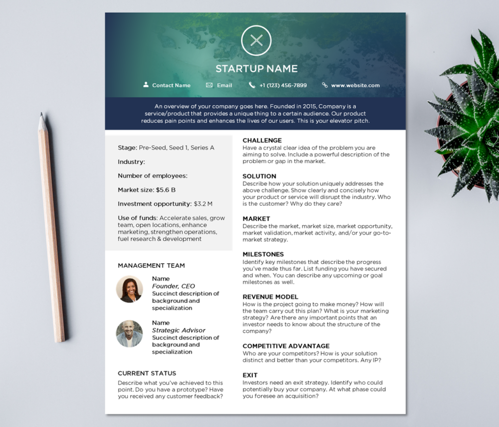
An investment teaser one-pager gives a potential investor a high-level overview of your company, your offering, and the opportunity itself — enough to make them want a meeting, but not so much that you’ve given away the whole pitch. It’s a door-opener, not the full deck.
The hard part is fitting a credible case into a single page, which is exactly why these tend to favor a minimalist design — the white space is what makes room for the numbers. When you build one, make sure it covers:
- Your unique selling point (USP). The one reason this opportunity stands apart.
- A short executive summary. What the company is and does, in a few tight sentences.
- Credibility markers. Major customer profiles, recognizable logos, or past wins that signal you’re a safe bet.
- The ask. The type and size of investment you’re looking for, stated plainly.
- Revenue drivers. Your main products or services and what each one actually earns.
- The financial story. Key historical metrics alongside your forecast, so investors can judge both track record and trajectory.
Investment teaser one-pager examples
A few investment teaser one-pagers to reference:
- Startup Fundraising One-Page Sheet
- Trustco Group Holdings Investment Teaser
- Ragnarson Fund One-Pager
- Milestone-Based One-Pager
Startup one-pager
A startup one-pager is close cousin to the investment teaser, but it does more than open an investor’s door — it’s a single, flexible summary you can put in front of investors, partners, or customers. Because those audiences want different things, the page has to be broad enough to inform all three without losing focus.
That makes “clear and concise” especially important here. You’re covering a lot of ground on one page, so every line has to earn its place. A solid startup one-pager usually includes:
- The basics. Your business name, logo, and a brief description of what you do.
- Your model and market. How you make money and who you make it from.
- The competitive landscape. Where you sit relative to alternatives, and why you win.
- Your team. The people behind it — often the single biggest factor for early-stage investors.
- Traction and plans. Your financials, milestones, and the road ahead.
- The honest risks. Naming your challenges builds trust rather than undermining it — sophisticated readers know they exist anyway.
On design: keep it clean and professional, and let strong images and graphics do the explaining where a chart beats a paragraph.
Startup one-pager examples
If you’re not sure where to begin, these startup one-pagers are good inspiration. When you’re ready to build your own, Xtensio’s Startup One-Pager Template is a handy starting point.
Product one-pager
A product one-pager zooms in on a single offering — a brief overview plus its features and benefits — and it does double duty. It markets the product to new prospects while also reminding existing customers what it can do.
Because it’s tied to a tangible thing, this format rewards specificity. Don’t just say a feature exists; connect it to what the buyer gets out of it. And lean on your strong suits — if the product is beautiful, show it; if it’s technical, let the spec table shine. A good product one-pager is informative and easy on the eyes, with each feature paired to the benefit it delivers.
Product one-pager examples
A few product one-pagers to study:
- Nike Grind Technical Data Sheet
- Augmented and Virtual Reality One-Pager
- IoT-Ready Network Connectivity One-Pager
Equipment one-pager
Equipment one-pagers sell physical machinery, and that changes the buyer’s questions. They’re not just asking “what does it do?” — they want to know exactly what they’re getting, down to the dimensions, and whether it’ll do the specific job they have in mind. Detail and proof carry the day here:
- Lead with concrete features and benefits. Spell out the specs that set your equipment apart from the competition — capacity, durability, compatibility, whatever buyers actually compare on.
- Show it, in high resolution. Crisp, well-lit images of the equipment do more to build confidence than any description. Buyers want to see what they’re putting money into.
- Make it easy to act. Always include clear contact information so an interested buyer can reach you with questions before they ever talk to a rep.
Equipment one-pager examples
A few equipment one-pagers worth reviewing:
- John Deere 5D Series Tractor One-Pager
- Bayer TruFlex One-Pager
- Caterpillar One-Pager
- Fiber Mountain Data Sheet
Tips on how to create a winning one-pager
Across every type we’ve covered, a few principles hold true. Whatever you’re building, keep these in mind:
- Keep it professional and polished. The page is a reflection of your brand — sloppy formatting reads as a sloppy product.
- Make it easy to scan. Organize it so a reader can find what they need at a glance, not after three passes.
- Include only what matters. Be ruthless about cutting anything that doesn’t help the reader decide.
- Make the call-to-action obvious. One clear next step beats three competing ones.
- Use strong visuals. Even text-heavy one-pagers benefit from a chart or image to break up the page.
- Proofread. Then proofread again — a single typo can undercut all that polish.
It’s worth saying what to avoid, too. The weakest one-pagers tend to run too long, fail to help the buyer actually evaluate or decide, or leave out a clear call to action. And here’s the uncomfortable truth: an unhelpful one-pager is often worse than having none at all, because it costs the reader time without giving them anything back.
So craft yours carefully. The goal is a page that’s as informative as it is easy on the eyes — enough to create a little urgency and move the reader one step further along their buyer’s journey.
How Content Camel can help
Building a great one-pager is one challenge. Making sure the right version actually reaches the right buyer at the right moment is another — and that’s the gap Content Camel was built to close.
Once you’ve created your B2B, SaaS, product, or investment one-pagers, Content Camel gives you one place to organize all of them. From there, you can:
- Keep every asset in one searchable library. No more digging through shared drives or pinging a teammate for “the latest version” of a one-pager.
- Share with trackable links. Send a one-pager to a prospect and see whether they actually opened it — and what they looked at — so your follow-up is informed, not guesswork.
- Surface the best version for each deal. Filter and categorize your collateral so reps grab the right one-pager for the right audience every time.
If you’re thinking about your wider library, our posts on crafting sales enablement content and running a sales content audit pair well with this one.
Final thoughts
There’s no single “best” one-pager — and that’s really the takeaway. A winning one-pager isn’t about following one formula… it’s about matching the format to your audience, leading with what they care about, and giving them a clear next step. Get those three things right, whether you’re pitching investors or selling equipment, and the page will do its job.
Found the format that fits? The next stop is the build: our guide on how to create a sales one-pager walks through the checklist, the copy, and the design from a blank page to a finished asset.
Ready to organize and track every one-pager your team creates? Sign up for Content Camel here.
Topics