On this page
A resource center page is a dedicated hub on your website that organizes your best content — guides, templates, case studies, videos, webinars — in one place, so buyers can self-serve the information they need to evaluate you. It’s different from your blog: a blog is a stream, a resource center is curated and organized around what your visitors are trying to accomplish.
If you’re anything like me, you probably have a handful of favorite websites you visit on the regular — whether it’s for the latest on the best sales enablement tools, tips on how to create a one-pager for sales, or a little marketing inspiration to get the ideas flowing. What those sites have in common is that they give visitors something genuinely worth coming back for.
So let’s talk about why a resource center matters more than ever, how to build one your buyers will love, and what the good ones look like (with real examples below). There’s no limit to what you can include… as long as it’s valuable to the people reading it. And if you want to publish one from your existing content without a web project, that’s exactly what our resource center pages feature does.
Here’s why it’s worth the effort, as content strategist Manya Chylinski puts it:
- It enables customers and prospects to easily find the information they seek.
- It encourages discovery of content. When prospects look on your resource page for one product line or in a particular market segment, they build awareness of additional products and services.
- It increases “stickiness” of your website. It’s the single place for your best content.
- It makes it easy to share your links and recommend your content to others.
So how do you make an amazing website resources page? Ultimately, you focus on one thing: making it valuable for your buyers.
That’s the whole reason to invest in a well-organized resources page — to let your buyers navigate and self-serve through your collections of content. After all, today’s buyers strongly prefer to educate themselves before they ever reach out to sales.
Give Sales and buyers what they want
That’s reason enough for marketers to shift toward a smarter collection of resources, built around a buyer-centric approach. The end goal is simple: help people self-serve the content that helps them buy.
Below, we’ll walk you through exactly how we created the Content Camel Resources Center to support our buyer’s journey toward a successful conversion.
Creating an amazing content resource center
When you start building a content library for your website, you’ll notice a few things that most resource centers have in common:
- A great layout — yes, you need this.
- A variety of content — yes, this too.
- Content categorized only by type — and this is where things tend to go wrong.
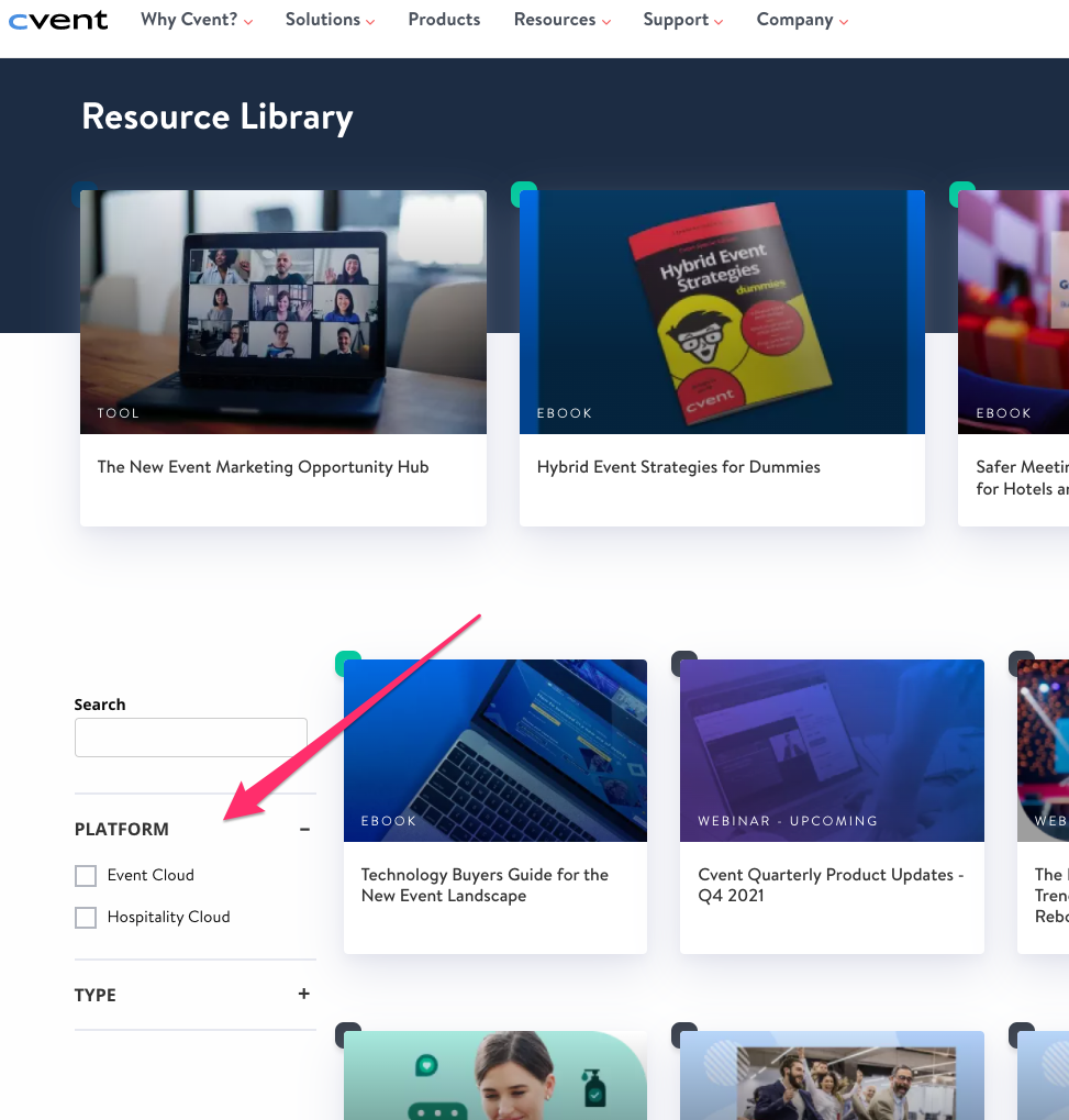
Take a look at Cvent’s Resource Library. You’ll notice they group their resources by type and platform only. Chorus does much the same thing.
Salesloft, Outreach, and HubSpot, on the other hand, add topic — and in some cases role — to make the content actually relevant.
This doesn’t mean filtering by type is useless… it does mean it rarely helps a buyer make a decision any faster. Sorting by “magazine vs. video vs. ebook” isn’t a buyer-friendly approach. Instead, it puts the buyer through a needless process of filtering and skimming through an exhausting amount of material before they find what they actually came for.
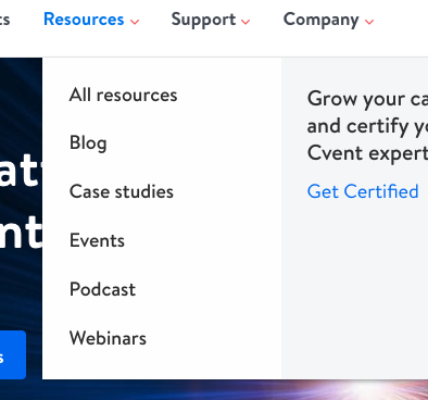
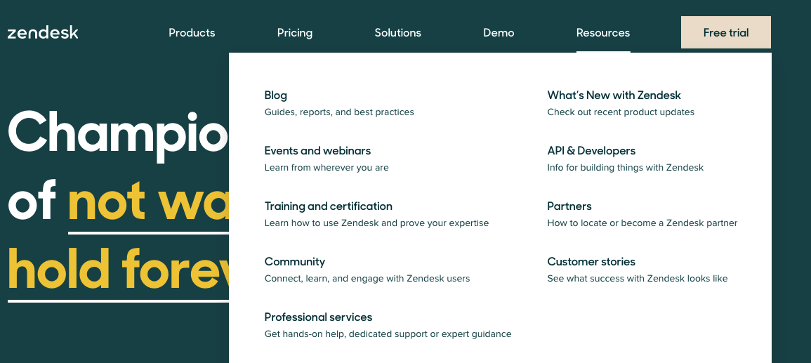
Zendesk takes a similar route, grouping all of its content into different types.
You probably don’t need an analogy here, but I can’t help myself.
Imagine walking into a library to find information on marketing best practices… and being forced to first decide whether you want a magazine, a video, or a stack of books — before anyone will tell you where the marketing section is. That’s essentially what a type-only filter asks your buyers to do.
Now, when you first sit down to build your resources page, you might naturally take that same type-first approach — and honestly, that’s okay as a starting point:
- Design your page layout first, following your company’s branding guidelines.
- Select a variety of content you want to include — whitepapers, solution briefs, guides, templates, how-to articles, ebooks, videos, and so on.
- Once that’s done, decide how you’ll group or display that content on the page.
Those three steps are a fine place to begin. Just remember that, above all, you’re trying to help potential buyers.
When you create content with a buyer-centric approach, your resources center should reflect that same approach. It should exist to help buyers find out more about your products and offerings — not to make them work for it.
Done well, it will simplify your buyer’s journey and shorten your sales cycle. That’s exactly the approach we took with our own Content Camel Resources Center.
Our process
Most resource centers, as we’ve seen, organize by “types” of content — ebooks, webinars, videos, and the like.
A better way is to organize by the topics that prospects and customers actually care about. A visitor is far more interested in Topic X or Topic Y than in digging through types to find the content that covers what they came for.
So for our own resources page, we thought carefully about the kinds of visitors who’d be coming to it — marketers, sales leaders — and what they’d be trying to accomplish: get templates, learn tips, discover strategies, see a product demo. Then we grouped the content along those lines.
This approach has a nice bonus, too: it’s great for search engine optimization (SEO). It not only helps you build out content hubs, but also helps you link those hubs to one another. Now that’s what we’d call an amazing website resources page.
Below, we’ve pulled together a few more details on how to build the best resource page possible.
Find your leverage
A great place to start is researching your competitors. What are they doing with their content and keywords… and, more importantly, where are they failing their buyers with content gaps?
We found that most of our competitors build content hubs without a buyer-centric approach. As we mentioned with Cvent and Zendesk, Highspot also groups its resources by media type — blog, ebooks, webinars, and so on.
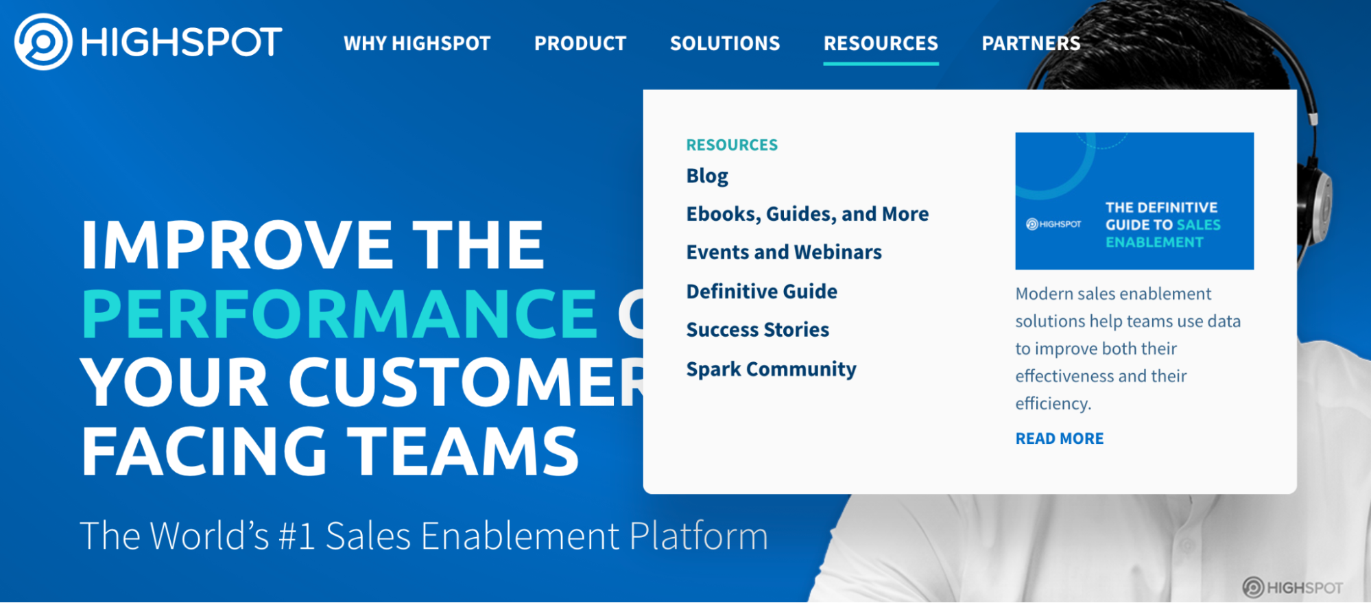
This is something we found to be ineffective for buyers. They’re searching for solutions to their pain points, looking to evaluate options, wanting comparisons, or hunting for industry information. A content-type approach doesn’t help with any of that.
We saw something similar with another competitor of ours, Uberflip. Uberflip has gone along with the rest of the pack — media types and a filtered search — but they also built a featured content library on the main page that catches the eye immediately and leans a bit more toward the buyer-centric approach.
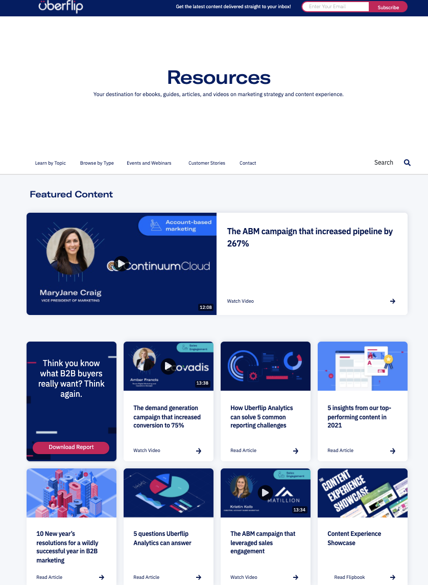
Our research showed there simply aren’t many sites that let buyers find information on their own and feature content that directly addresses their pain points — what they’re truly trying to accomplish. And even when a site does, the intent often gets lost somewhere in the filters and navigation.
That’s where we found our leverage: giving people exactly what they came for.
Know your target audience
Who do you want visiting your resources center, and why do you want them there? It’s crucial to understand your target audience before you start building, because that’s what lets you lay out your content effectively and speak directly to their needs. You can even anticipate their pain points before they voice them.
We wanted our buyers to land on our resources center, self-serve great content, and make their decision quickly — shortening the sales cycle in the process. But that only works if you greet them with content that genuinely speaks to those pain points.
If you’re still mapping out what resonates with your audience, our marketing persona template is a good place to begin the message-testing process. Everything you map out for your personas can be translated directly into how you organize content on your resource pages.
Organize your content effectively
Another piece that’s absolutely essential to a successful resources page is a thoughtful content organization strategy.
In the best case, you’re essentially building playbooks — content journeys that visitors can move through to experience your content. We think about this in terms of what finding your leverage and knowing your audience uncovered: the detail behind who your audience is and what they’re looking for.
From there, you take them on a journey aligned with their stage of the funnel and their intent. Thinking about it this way encourages a conversion-oriented approach — and it tends to surface exactly where you have content gaps.
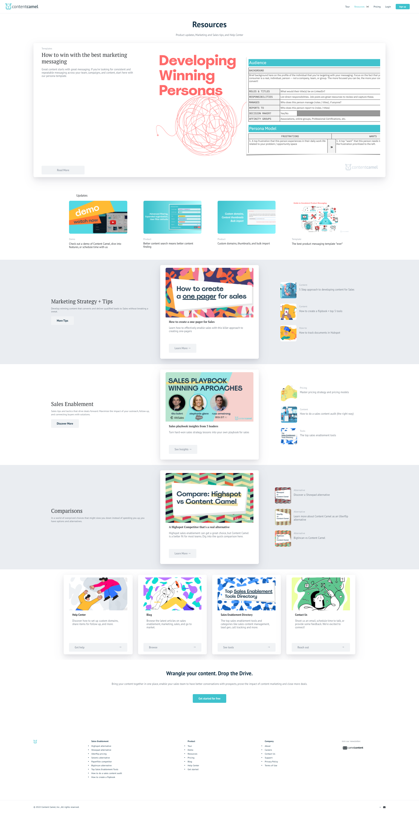
Here are the categories we chose to best represent and organize our content:
- Featured Content. Our strongest, highest-value pieces, front and center.
- Updates. Fresh news so returning visitors always find something new.
- Marketing Strategy + Tips. For the marketers in our audience.
- Sales Enablement. For sales leaders and teams.
- Comparisons. For buyers actively evaluating their options.
And this is just a beginning for us — our first version of a resource page. We also added a card view at the bottom that links out to other resources already living on the site, which can be valuable for buyers who are ready to take the next step in their decision.
In a similar way, Content Camel’s Sales Content Management Tool helps you organize content into topics and categories — but for use by your sales and marketing teams. As you move beyond launching your resource center, it’s worth considering as a way to help your teams maximize the impact of all that content.
Plan your calls to action
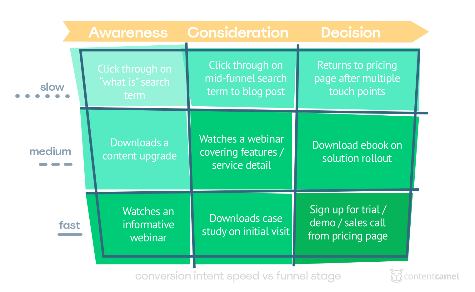
We don’t feature this on our own resources page yet, but it’s always a good idea to think about fast, medium, and slow conversion points. For us, as a business-to-business (B2B) SaaS company, that might look like:
- Fast. Sign up for a free trial.
- Medium. Schedule a demo.
- Slow. Join our newsletter.
So as you map out your buyer’s journey and bring people to your resources page, think about which conversion points make sense for your prospects and customers. The real question is: what’s the right content offer at each stage?
Resource center page examples: 5 layouts that work
We’ve referenced a lot of sites above, so here’s the same ground condensed into the five layout patterns you’ll actually choose between. No layout is “the best” — the right one depends on how much content you have and how your buyers shop.
1. The type-only grid (Cvent, Zendesk, Chorus). A filter bar across the top — ebooks, webinars, videos — and a card grid below. It’s the easiest to build and the most common, which is exactly why it underperforms: buyers don’t arrive knowing which format holds their answer. Use it only as a starting scaffold, and plan to grow out of it.
2. The topic + role filter hub (HubSpot, Salesloft, Outreach). Same card grid, but the primary filters are topic and role, with type demoted to a secondary filter. A sales leader can pull everything about onboarding; a marketer can pull everything about attribution. This is the layout most B2B teams should aim for once they pass roughly 30 assets.
3. The featured-content library (Uberflip). A curated “start here” band at the top — your strongest 5-10 pieces, hand-picked — sitting above a filterable library. It works because most visitors never touch the filters; the featured band does the guiding for them. Good when a few flagship assets carry most of your evaluation story.
4. The multi-hub with a central index. One hub per product or audience, connected through a central resources page. This is the pattern for multi-product companies: a buyer focused on one product never wades through content about the others, and each hub becomes its own SEO cluster. More upkeep, more reward.
5. The embedded collection page. Instead of a custom-built page, you publish a curated collection from your content library straight onto your site — which is how our own resources center works, and what the resource center pages feature is for. The layout is a clean card set; the win is operational: when the library updates, the page updates, and every asset carries tracking. It’s also the only layout on this list a sales rep can spin up per-prospect in minutes.
If you’re scoring your own page against these: pattern 1 is where most sites are, pattern 2 or 3 is where buyers want you to be, and pattern 5 is how you get there without a quarter-long web project.
Think of it as a hub, not just a page
Here’s the bigger shift we’d encourage you to make: instead of treating your resources page as a list, treat it as an integrated hub of all your high-value sales content — one that addresses your buyers’ key pain points and ties your products and services together.
That’s exactly what we did. If you have more than one product offering, you can build a resource hub for each product and connect them through a central resources center. That makes it far easier for a buyer to navigate to the right content when they’re focused on a particular product or service.
Once your resources center showcases all of your winning content, it starts to support both your inbound and outbound efforts. Rather than relying on scattered PDFs, ebooks, and one-pagers, you can send prospects down a clear path to the resource pages that make sense for them — giving marketing and sales a meaningful set of tools to deploy throughout the sales process.
And remember: our resources page is just a starting example. We built the Content Camel Resources Center around what our buyers are actually looking for, fully committed to helping them self-serve great content and shape their own buying decisions. As we keep measuring and adapting — and refining those fast, medium, and slow conversion opportunities — we’ll keep evolving the pages and the resources we offer. That’s the kind of shift more and more marketers are making to keep their content truly resourceful.
How Content Camel can help
Organizing a resource center by topic and role — rather than by content type — is exactly the kind of problem Content Camel was built to solve. The founders saw how much great content goes to waste simply because no one can find the right piece at the right moment. The resource center pages feature takes it one step further: publish any collection from your library as a branded, embeddable resource page in a couple of clicks.
With Content Camel, you can:
- Organize everything in one place. Gather all of your sales and marketing content into a single dashboard, tagged by topic, category, and use case — the same buyer-centric thinking behind a great resources page.
- Filter and find content the way buyers think. Categorize assets so your team can surface the right piece for a specific pain point or funnel stage, instead of hunting through folders.
- Share and track what’s working. Send prospects the content that fits where they are in their journey, then see which assets actually move deals forward.
In other words, the buyer-centric approach we recommend for your public resources page is the same one Content Camel brings to your internal content — so your teams can get the most out of everything you’ve created.
Final thoughts
A truly amazing resources page isn’t about cramming in more content or adding more filters. This doesn’t mean layout and variety don’t matter — they absolutely do. It does mean that the real difference-maker is organization: grouping content by the topics and roles your buyers care about, so they can self-serve their way to a confident decision.
Start with your audience, find your leverage, organize around intent, and let your resource center grow into a genuine hub. Do that, and you’ll shorten your sales cycle while giving buyers exactly the experience they’re hoping for.
Let us know how you put this approach to work in your own resources center!
Ready to organize, share, and track the content your buyers actually want? Get started with Content Camel here.
Topics
Frequently Asked Questions
Are buyers really engaging with Resource Centers?
How do you manage a content resource center?
- Always keep it up-to-date with fresh content.
- Create valuable and helpful content.
- Organize the content with the buyer’s use-case in mind.
- Choose a content management tool.
- Monitor traffic, conversion rate, and your overall best assets.
- Always keep optimizing it for improved results.